Topics on This Page
Filter Data
Use the Filters bucket in the Chart Builder to filter data in the following ways:
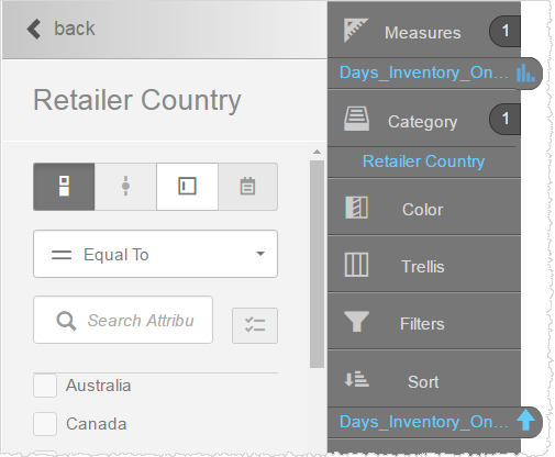
- Drag and drop a measure or attribute from the Subject Area onto the Filters bucket.
- Filter on measures and attributes that have already been added to the report, as described in this section.
- Visually filter a report by dragging a capture rectangle around attribute values in a chart.
- In Visualizer, add one or more measures and attributes to plot a chart.
- Search for or drag and drop a relevant column onto the Filters bucket. The Filter Editor opens.
 Tip: The Filter Editor displays the first 100 values, though you can find additional values using search.
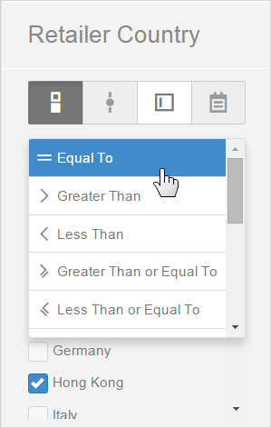
 - Select the filter style. Styles are available based on the data type, including the following:
- Checklist (checkbox)—for multi-select text-based or numeric data types.
- Slider—for date, datetime, and integer data types.
- Value—for text-based data.
- Date picker—for date data types.
- Select the filter operator. You can do the following:
- Select values from the list and use the operators to specify a filter set.
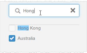
- If there is a long list of filters, use the search field to quickly find those you need.
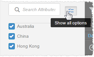
- For long lists, use the Show selected options only button.
To view the first 100 options, click the button again.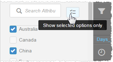
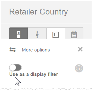
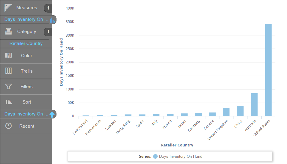
- If you want the filter to apply to the query result set in memory, click More options → Use as a display
filter. By default, this setting is off and the filter operation is carried out at the data source.
- Select values from the list and use the operators to specify a filter set.
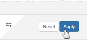
- Click Apply. The chart updates to
reflect the filter applied to the data.
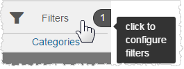
- Select the Filter bucket to see the current filter. Tips:
- You can toggle the filter on and off using the toggle switch. In a dashboard, when a filter is toggled off, it maintains its state, but it is not applied to the dashboard.
- To change the filter condition, click on the filter name in the Filters bucket.
- A report can have multiple filters.
- A filter column does not have to be in the Category bucket and it does not have to display in the report.
- If you want to filter on a column you are already using in your chart, you can drag the column from its current bucket to the Filters bucket. Visualizer will add it to the Filters bucket, but it will not remove it from its current bucket.
- You can remove the filter by clicking Remove.
- You can use a Visualizer report expression as a filter by dragging and dropping it to the Filters bucket.
- To filter on date type attributes, use the range (between) condition and the date picker.
- Text-based value filters can have multiple values separated by a delimiter. Enable Allow Multiple Values and specify the values and what delimiter to use.
- Click Save.
Visually Filter Data
Visually filter data in most reports by dragging a capture rectangle around the attribute values in a chart or table to select only those values. Some reports, such as pie and donut charts, use keyboard commands to filter.
Alternatively, you can filter the data by dragging an attribute or measure to the Filters bucket in the Chart Builder.
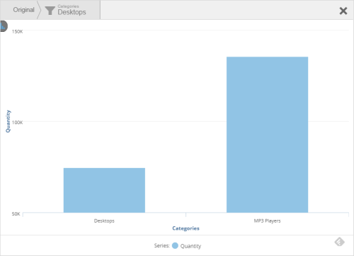
Drag-Select Data to Filter
Drag-select works both while editing in Visualizer and when browsing reports in dashboards.
- Click and
drag across the the attribute values you want to filter.
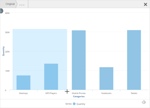
- Release the selection. The chart
updates based on your selection, and the name of the filtered column
displays in the Filters bucket.


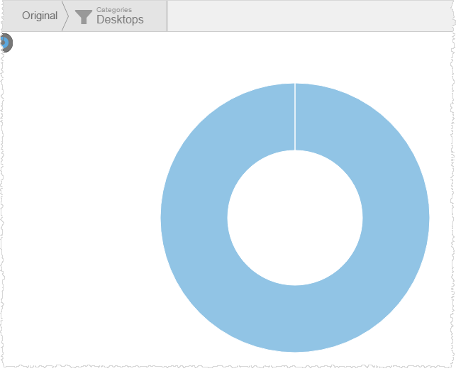
Use Keyboard Commands to Filter Pie and Donut Charts
Pie, donut, and semi-donut charts use keyboard commands instead of drag-select.
- Press a command key:
- On a PC: press Ctrl.
- On a Mac: press Shift.
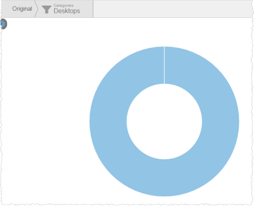
- Click a segment of the chart. The segment enlarges.
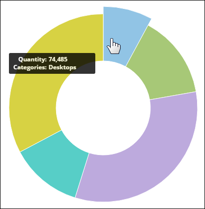
- Release the keyboard key you pressed. The chart (and dashboard, if in dashboards) updates to use the selected filter. You can see the current filter at the top of the work area.
 Tips:
Tips:- Click
the Filters bucket to see or change the filter conditions.
- You can toggle the filter on and off using the toggle switch.
- You can remove the filter by clicking the Remove icon.
- A visualization can have multiple filters.
- You can use a Visualizer report expression as a filter by dragging and dropping it onto the Filters bucket.
- Click
the Filters bucket to see or change the filter conditions.
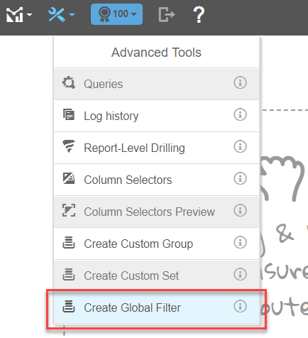
Create a Global Filter
Global Filters are reusable filters that can be shared in multiple Visualizer reports and Dashboards in your space. You can combine multiple filter criteria together to create advanced filters.
Note: You can nest filter conditions to create advanced filters such as the following BQL-based version:
- ([Categories.CategoryName] IN ('Beverages','Dairy')) AND ([OrderDate: Sum: UnitsInStock] < 10000 OR [OrderDate: Sum: UnitsOnOrder] = 0)
This requires use of the Expression Editor and knowledge of writing BQL expressions.
- From the Advanced Tools menu, select Create Global Filter.
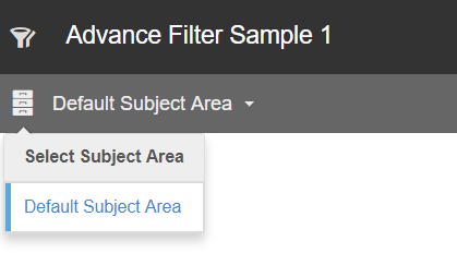
- Type a name for your Global Filter.
- Select a subject area to assign the Global Filter.
- Click Add Filter.
- Select the preferred measures and/or attributes.
- Arrange (nest, group, etc.) and apply the available modifiers (and, or).
- Save the Global Filter. You can edit Global Filters after you save them to a subject area.
Note: Other users in your space can apply Global Filters to dashboards.Tip: You can combine custom Sets and Global Filters to create dynamic value filters.
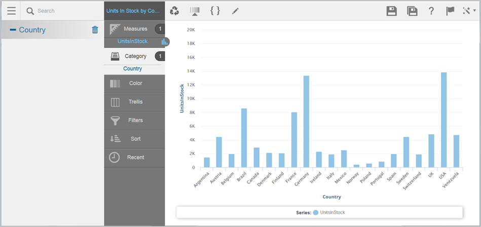
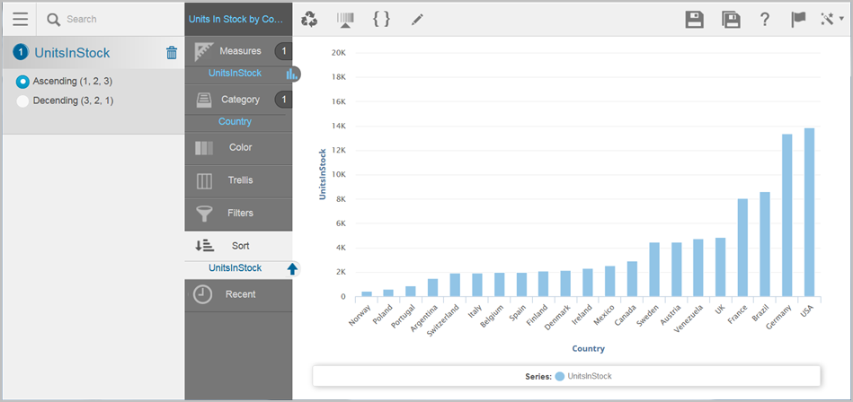
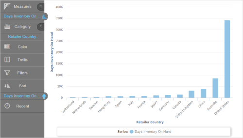
Sort Data
Sort data in a report using Sort in the Chart Builder. Measures can sort ascending or descending, while attributes sort alphabetically or reverse-alphabetically.
- Add the attributes
and measures you need to create your chart.

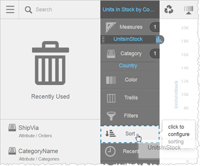
- In
the Chart Builder, drag a column and drop it on Sort. Note: Sorts do not take effect by dragging a column from the Subject Area to Sort. You must use a column that is already in the Chart Builder.
- Visualizer sorts the measure or category (attribute) according to its default sort criteria.
 Tips:
Tips:- You can change the type of sort to apply. Visualizer provides sort options in the Subject Area.
- You can add additional columns to Sort.
- When sorting on two measures where one is an expression, the sort on the expression takes precedence. Expressions are sorted at mid-tier, whereas basic columns are sorted at the database level.
- Click Save.